
Gym Bros Squad is a community-driven apparel brand that blurs the line between sportswear and streetwear. As art director, my goal was to go beyond designing clothes and instead create a unifying identity that gym-goers could wear with pride both inside and outside the gym. By introducing bold visual symbols—like the signature red frames—I positioned the brand as a movement of belonging, discipline, and camaraderie, giving it the edge of fashion while keeping the grit of performance.
creative Direction:
Case Study
CHALLENGE
Most fitness apparel brands focus on performance or aesthetics. My challenge was to go beyond the product and craft a sense of community.
I needed to create a recognizable symbol that could live in and outside the gym, instantly sparking connection between members.
my
APPROACH
I introduced a pair of bold, red lensless plastic frames as the brand’s iconic accessory. The frames act as a fun conversation starter . A subtle uniform that signals belonging to the Gym Bros Squad. Much like a team jersey, but casual enough to integrate into everyday gym life.
Why frames?
They’re lightweight, wearable during workouts, and instantly recognizable.
Why red?
Red conveys strength, energy, and visibility. An easy marker for recognition.


GOAL
As a brand built on the mission of fostering community and squad mentality, the frames act as a unifying uniform.
VISUAL SYSTEM
Integrated the frames across campaign visuals, photoshoots, and digital presence.
Styled models with the frames to create an instant squad identity.
Balanced streetwear vibes with gym authenticity to position the brand as both functional and statement-making.

result
-
Built a visual identity system that transformed simple apparel into a movement.
-
The frames became the community marker, a unifying element that goes beyond clothing.
-
Established Gym Bros Squad not just as a brand, but as a tribe people want to join and be proud to belong to the red frame community.
social media launch teaser
For the social media launch, I designed posts that paired the illustrated frame with the brand’s logo mark. The goal here was to design visuals that sparked intrigue and curiosity, driving traffic to the page while growing the community of followers.

the brand
the product
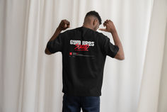
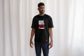
Targeting gym-goers who take pride in their milestones and want to showcase them, I designed shirt graphics that are both elegant and visually appealing. By combining approachable typography with bold graphic elements, I shaped the brand’s identity and crafted a unique, recognizable logo mark that was integrated across the apparel line.

creative graphics
Across the different graphic lines, I drew inspiration from store receipts, movie credit blocks, and gym-goer lifestyles to design visuals that not only reflect the spirit of the brand but also feel authentic and relatable to the target audience.

We don’t just eat; We strategize Caffeine is not optional—it’s pre-war protocol. We count macros like accountants and calories are our currency. Protein isn’t just food, it’s bricks for the build. We don't look this good by accident. We earn every vein, every pump, every stare.
The lifestyle
The receipt
The muscular body stands as proof of the hard work invested in the gym — the body itself becomes the receipt. I designed this apparel line to feature a store-style receipt graphic, highlighting the different elements and ‘ingredients’ that contribute to building that physique.


I designed this apparel line to mimic a movie credit block, highlighting the dedication, process, and journey of gym-goers as the true stars of the story.


